Friday, 13 May 2016
Invocat Film Poster

This is my completed Horror film poster for my movie 'Invocat' Overall I have made very slight changes to the poster however moving some of the logos about and readjusting where I had placed certain texts has made a big different to its look.
As you can see on my draft poster that I wrote 'Theatres' instead of 'Cinemas' as I had been inspired by a number of American horror film posters and copied theatres instead of writing it in the proper English way
Thursday, 3 March 2016
Directors Commentary
The song, 'I only have eyes for you' begins to play as you watch a man walking through a graveyard which seems to be contradictory to the sadness and death of the scene. I used it to help my viewers understand that the evil is powered by the love my lead protagonist feels towards certain people and turns it against her. The contrapuntal soundtrack helps to strengthen the comparison between a caring, average life which is associated with the Doo Wop Traditional Pop genre for the song 'I only have eyes for you' by The Flamingo's and the destructive and out of control life that Cecilia is experiencing.
The juxtaposition is developed when the audience watches a man walk through an abandoned and lifeless graveyard but is seen raising a glass in cheers to salute someone he obviously knew which is an act of celebration therefore looking unnatural given the setting.
There are intentional contradictions throughout my film, such as a woman rebelling against society's stereotypical traditions of marriage and family life therefore it was important that my opening piece of music played to those contradictions.
I tried out this part of the trailer laying a melancholy soundtrack over the footage, however I felt like it made it seem very normal and it lost its tension.
The age of the song seemed appropriate to the age of the wandering man making you question if the music reminds him of when he was young and in love.
Tuesday, 1 March 2016
Audience Feedback
For all three of my ancillary tasks the receival of audience feedback has helped to make my work such as my poster and trailer more professional and realistic. After completing my final drafts I published them on 'Invocats' official Facebook page where I invited comments and likes from my viewers. These posts would demonstrate whether or not my ancillary tasks were received correctly and what they think I could improve on.
In the video below I ask friends and classmates to give me their views on how to make my trailer better.
In the video below I ask friends and classmates to give me their views on how to make my trailer better.
Wednesday, 24 February 2016
Official Instagram Site
https://www.instagram.com/invocatthemovie/


I chose to put these images on my Instagram account so that I could provide my viewers with an idea of what the film is about and show them glimpses of what they are to expect.
I did not want to give much away as that would spoil the film however by providing them with snippets and screen grabs from the movie it build an excitement as they would use their imagination to understand what the image meant which gave them something to look forward to.
Official Twitter Site
https://twitter.com/InvocatOfficial


It was very important for me to get across my point quickly and effectively as I had only very few characters I therefore wanted to use the hashtag #forbetterorforworse to create a platform where interested viewers could learn more about the central theme of the film.
Twitter is very a social tool and I needed an app that could quickly get the word to spread about my film as unlike Instagram it is not very visual and relies on a restricted amount of carefully chosen words.
Twitter was one of my main channels to PR my film.
Wednesday, 17 February 2016
Build For My Finished Products
What media technologies did I use in the construction and research, planning and evaluation stages?
For the research of my official film website, poster and billboard I used two main media platforms for the majority of my search. Those were YouTube and Google. For the planning towards my poster and billboard I really relied on IMDb, Google and Pinterest for inspiration and sensible ideas that I could incorporate into my own product. By just searching 'horror film posters/billboards' into Google Images a large wide variety of results were supplied to me from both popular movies and small unknown horror films, this made it difficult to pinpoint favourite templates and ideas as some were not relatable to my own product. I therefore searched for the 10 most successful horror films on IMDb and then looked at images of their posters and billboards using Google Images.
When it came to constructing my actual ancillary product for example my poster and billboard I did the majority of the photo editing on IPhoto's edit programme on the MacBook and when it came to applying text I added the image onto Adobe InDesign. Surprisingly IPhoto had a large array of tools and appliances that made editing really easy whilst still offering a professional over look. I was able to blur out the unnecessary stuff in the background of each photograph and use the blur and gaussian effect to dilute the image to create that ghostly effect for both image and text. For the writing I was mostly supported by Adobe Photoshop to create that bloody stretched and chaotic writing to construct a sinister and unfriendly finish.
The British Film Institute's (BFI) website and Netflix contributed towards the inspiration for my Ancillary tasks as they showed my film posters and trailers under a large assortment of genres that although did not religiously connect with my own piece but helped give me inspiration, for eg, the image below of Kendall and Kylie Jenner for their Topshop campaign has nothing to do with the horror genre or even film however, the image inspired me to produce my own poster similar to theirs. The idea was to use both Mollie and Lydia's face looking in opposite directions which portrayed her own controlled personality and the one possessed by the curse, not only that but it helps to show the generations affected by its evil.
What have I learnt from my Audience Feedback


As you can see from the photos above, I received feedback through many media platforms such as YouTube, Facebook and Twitter. I was informed on how well my audience had responded to my Trailer and Poster through the comments written beneath it. Overall the responses were successful and encouraging telling me that it was "really scary".
Another way I gained feedback was during school and over my blogger account where classmates gave me improvements and suggestions on my work so far. All of the responses were really helpful, a common improvement I was given was that in the scene where my protagonist is given the necklace from her step mum the speech isn't very clear and the background soundtrack is too loud. I believe that because this is such a recognisable issue I needed to alter it to make my trailer more enjoyable to watch. On the other hand there were a few comments which I did not think were necessary to apply to my tasks, for example, I was told that my trailer was too short however this was done to create a snappy and fast paced effect. I did not want to reveal or give away too much to my viewers as it would spoil the film. I therefore applied short and suspenseful clips to enhance the horrific genre and create a horrific and uncomfortable atmosphere to keep my audience at the edge of their seats.
Overall I have asked around thirty people from the age of 17 upwards as I wanted to see how the trailer was received according to the age group. On the whole I am aware that my audience who fall under the age category of 40 - 60 found the trailer ineresting and successful as there were characters in it that they found easier to relate to for example the dads behaviour helped them understand his grief and made the relationship between my on-screen character and viewers more personal. However people who watched the trailer and fell under the category of 17 - 20 thought the trailer was really scary because they could imagine it happening in their own houses and the majority of the cast were their age group.
Tuesday, 16 February 2016
Evaluation of My Horror Billboard

The film's Title 'Invocat' has to be the boldest and most memorable aspect about the billboard. having been inspired by the poster for 'Sinister' I decided to use the colour red to help induce the feelings of murder and despair which relate to Halloween. The Bold text has been spaced out to symbolise how long the curse has been in the family and the distance between sanity once the necklace is worn and has its power over you.

Monday, 15 February 2016
Evaluation of My Horror Trailer
In what way does my media product use, develop or challenge forms and conventions of real media products?
Whilst I was carrying out my research about horror trailers, I noticed that there are a few key conventions that are frequently used in major horror films. From this format research I noticed characteristics that I could use to create a realistic horror trailer of my own.
My trailer begins with a disclaimer showing the age appropriateness of my trailer.

As you are able to see, the MPAA age rating clip reveals to you that under 17 year olds are not permitted to view this film without an accompanying parent or adult guardian. It is brought to your attention that that the following trailer will contain adult material such as mild violence or inappropriate scenes and urges parents to learn more about the film before taking their young children with them.
The opening sequence of my trailer is the chosen film institution logos, this is because I wanted to get it out of the way. I chose to have my trailer produced and distributed by New Line Cinema and Warner Brothers because my targeted audience will be more attracted to this film as they are a popular company having produced major successful horror films such as The Conjuring, The Hobbit and The Texas Chainsaw Massacre. My viewers will recognise the logos and will identify that they have enjoyed other films that they have released and would therefore be more inclined towards watching this film as they will feel confident that it will be enjoyable. I chose these two popular film institutions because my research highlighted to me that they have produced films under a variety of genres which have been extremely good it also seems to me that both institutions have the most experience when it comes to psychological horror.
The conventions of a typical horror film have been put into action with the common idea of drawing my audience in through the use of suspenseful film. Using unpredictable clips making my viewers nervous, alert and on the edge by creating a dark, mysterious and twisted atmosphere.
My trailer opens with the image of an angel headstone and a man walking through the graveyard. I did this intentionally as it gives a realistic view on the movie which portrays to the audience that this could be a true story.

I recognised that in popular horror films there are always implications of danger early on the trailers which help to provoke the unsettling feeling of murder, this is why I chose to include the gravestones as they are a clear symbol of death and pain and help to explain the narrative.
In the next scene of my trailer I introduce you to the 'necklace' I felt like it was important to give my audience an understanding of the object early on in the trailer so as to stop confusion. I sat both my actors on the sofa so as to create a normal situation. In order to build suspense I think you don't want to start it off as if it a horror trailer otherwise it will feel fake. It should be normal for your stepmother to offer you a gift especially if it is for your wedding making my audience nt suspect a thing. When Anne (step-mum) says "your mother would have wanted you to have this, but remember one misstep leads to another" it follows another not so obvious convention for horror films. The scenarios displayed throughout the 2 minute trailer are always linked to the past which is returning to destroy their lives and affect her future consequently when cecelia receives the necklace that has been passed down through female generations for decades carrying the memories of the people who have suffered from the curse.
By now you have already been shown a series of different locations building suspense and tension and helping to make my audience unsure of what is to come next in the trailer which makes them intrigued and continue watching.
Showing a snappy flash of the future the audience will hopefully be shocked and surprised making them interested as we are now certain that this is horror trailer and due to the lack of people you see in the background you get the feeling that the town is low populated.
I have applied levi strauss' theory of binary opposites to my trailer. By inserting the wedding scene you get to see a ceremony which is pure and light where Cecelia does not seem to be
affected by this talisman. Leading to my ending kitchen scene which is a darkened place where the evil is revealed. In this clip we see Anne walking down the stairs having been awakened after she hears something smash downstairs. Grabbing a torch she makes her way into the kitchen briefly exploring the scene with her light. Not being able to see anything she is about the leave when she hears another smashing noise. Turning her torch towards the direction of the noise Cecelia's screaming disfigured face comes into the lens scaring the stepmother and leaving us wondering whether or not she managed to escape. This makes it easy to identify the genre.


The first part of typography that you see in the trailer is all in bold capital letters. The font gives nothing away to my audience helping to fabricate suspense.
The capitals stand out clearly to my viewers making it easily legible, the font itself is 'Times New Roman' providing a to the point supplying to the point text to address the uneasiness to my viewers. The text merges with the bleak black background relating to the documenting situation at the beginning of my trailer which coincides with my typography.
The text says "what it wants is unknown" I had initially planned on saying 'what the curse wants is unknown' however from the use of my evaluation of other film trailers the evil was not known to the audience creating a mysterious threat to the characters and making it more interesting. The threat is either concealed behind words or a mask of some sort. By saying "it" instead of curse it continues the feeling of the unknown linking to a supernatural entity. This adds more emphasis on the audience creating a chilling effect.

The text I have provided has been distributed throughout my trailer as it sets the narrative and helps my viewer to understand the plot.
Overall I am really happy with how my trailer looks. On the whole I believe that it creates an atmosphere that is unrecognisable and unwelcoming as the gaps in between the clips and slow and dark emphasizing the mysterious supernatural dimension. Having been inspired by the films 'It Follows' and 'The Conjuring' who both use black sequences and and suspenseful images such as that of a dark empty kitchen allowing the audience to imagine and come up with ideas about what is about to happen. This will make my movie more memorable and exciting.
Sunday, 7 February 2016

Thursday, 4 February 2016
Photoshoot Plan
Date/Time: Tuesday 22/12/2015, the shoot took place in the early evening
Pictures to Take: My aim for this photoshoot is to create an image that is beautiful and unsettling because on its own it's not at all threatening.
I do not want to give anything obvious away when my audience view my film poster therefore using an old Bust I placed the necklace around her neck to create a V for the film title.
For the Billboard I want to do have only individual shots of Lydia. I would like to have her sitting on one of my old chairs and also on the armoire.
Model(s): Lydia Gould - Eden
Costume: Fortunately have an old Victorian dress that I am going to get Lydia to wear.
Equipment:
Camera - Canon Powershot G7 X
Lighting - IPhone 6 Torches
Camera Tripod
Props:
The 'cursed' Necklace
Chair
Armoire
Possible Problems: The lights I am hoping to use won't work. I am also worried that the dress won't fit my model.
Risk assessment: Wires from any electrical equipment can act as a tripping hazard. To prevent this from happening I will tape down and exposed wires.
Monday, 1 February 2016


Sunday, 31 January 2016
My bloopers
I thought it would add an interesting twist on the perception of my trailer if you were able to see behind the scene footage of the making of 'Invocat'. Because the trailer was so scary I believe it is funny and comforting to watch the actors without the terror and the effort that went into the finished product. By watching the blooper reel it shows my audience the energy and time spent trying not to get distracted by each other going wrong and making hilarious mistakes. Inviting you into the set I hope that being able to watch the gag reel gives it a more personal and interactive feel on the movie.
Thursday, 28 January 2016
Official Facebook Site
https://www.facebook.com/Invocatofficial/
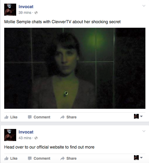
Below are a few screen shots of my official main social networking site.


Below are a few screen shots of my official main social networking site.


Monday, 11 January 2016
BFI Report
The British Film Institute (BFI) have produced a fascinating report that shows me current level of film 'consumption and the style and genre of film people enjoy watching.
This is really important for my studies as it highlights to me what my general audience will enjoy and what the most popular and successful film is to produce.
Below I have screen grabbed the most relevant slides from the BFI presentation.

This slide is an overview of what the total number of films watched in the UK over the past three months. This includes movies watched through a range of platforms such as TV, digital, cinema and piracy.
This next slide highlights the favourite genre of film that the general public enjoy watching.

The page is split into data by demographics and key market segments, such as people going to the cinema and DVD/BD purchasers.


These two pages are a full breakdown by demographics and marketing segments.
This next slide reveals to us the majority of the general public's genuine favourites. Considering genre preferences the British Film Institute asked participants to choose up to three genres for the offered genre list.
As you can see, the most favoured are, comedies, thrillers and sci-fi's.
The chart shows me the percentage of people who rate each genre as a favourite (up to three participants). Base : representative sample of GB 16+ population into film (1,978)


Sunday, 10 January 2016

Invocat Billboard Two

Although the differences between option 1 & 2 are minute because i was so focused on that one aspect of the billboard I could notice the difference. The hashtag 'for better or for worst' and the second options hashtag 'hell calls hell' is the only change I made to both posters. Although I feel like overall image with #FORBETTERORFORWORST on it looks the most professional, I believe that it all relates to much to weddings giving my viewers the wrong impression. Therefore #HELLCALLSHELL works best as it also informs you about the meaning behind the film title.
Friday, 8 January 2016

Subscribe to:
Comments (Atom)